ACCENTURE
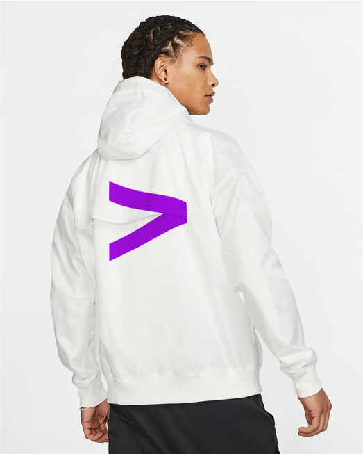
As their long-term brand partner, we have successfully evolved Accenture from a strictly B2B consultancy to a powerfully creative, flexible and ultimately human brand.
The idea behind the new Accenture brand was to deliver on the promise of technology and human ingenuity – creating a more vibrant, emotional and approachable brand that is responsive to our ever-changing world.
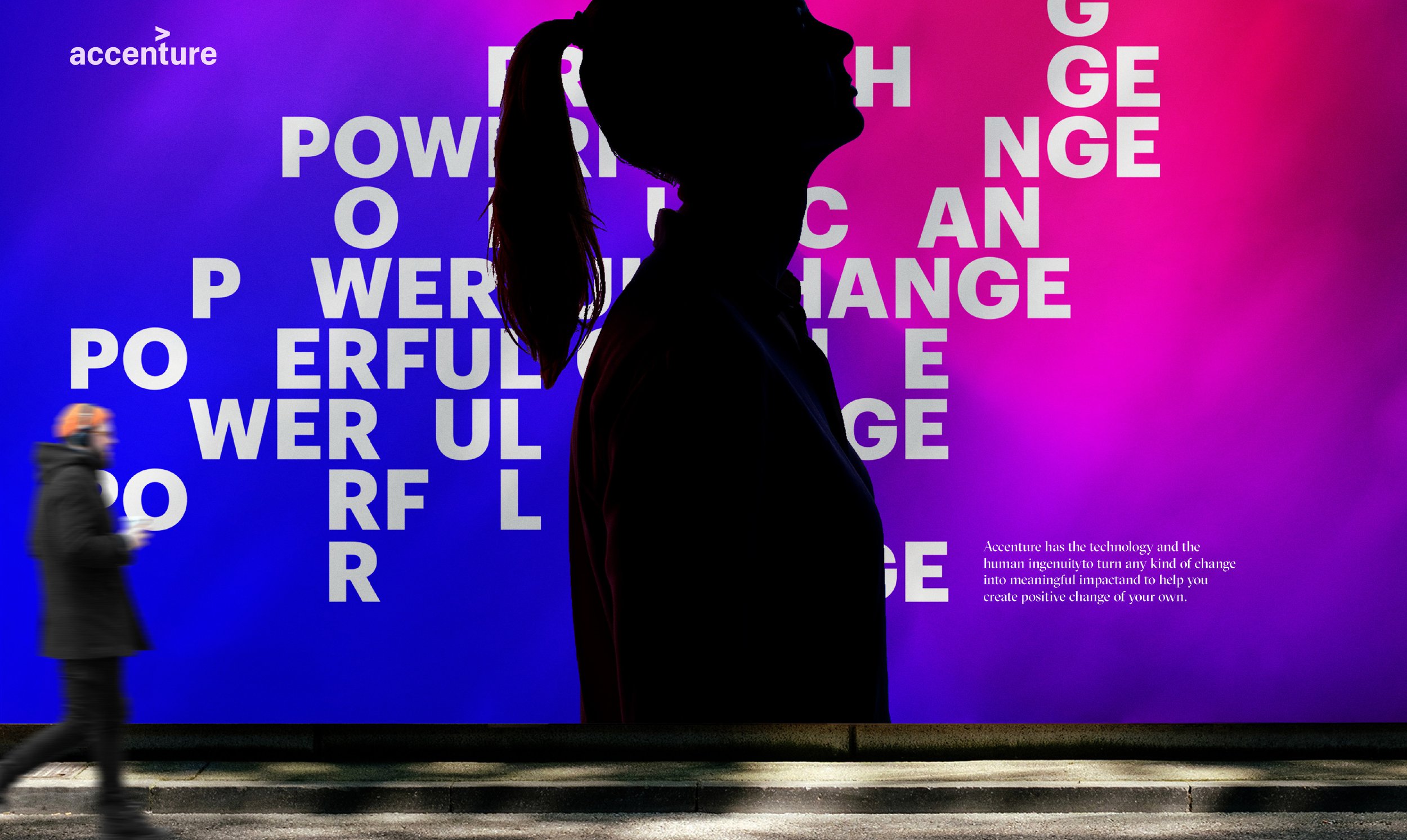
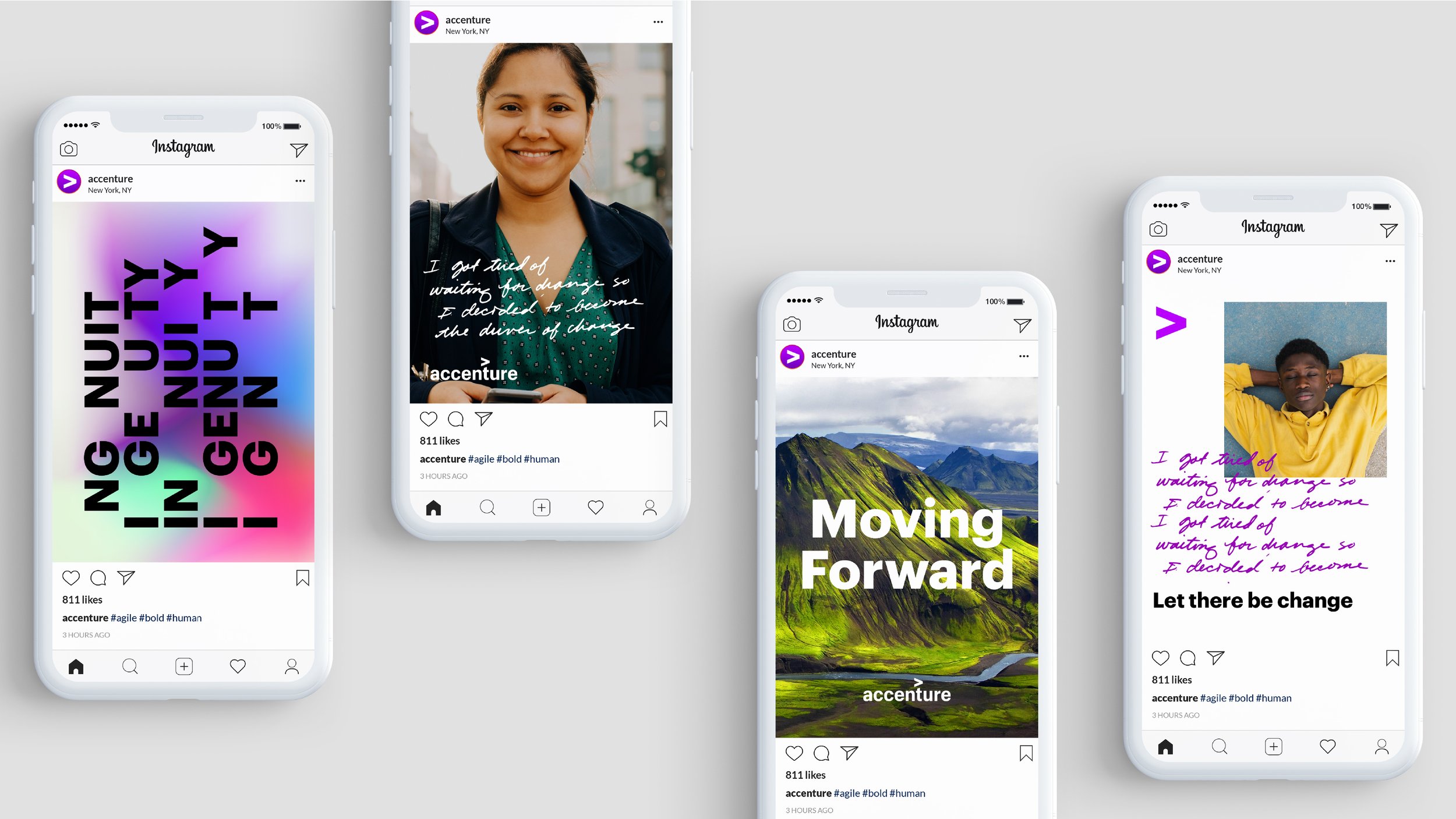
Modern brands are no longer static
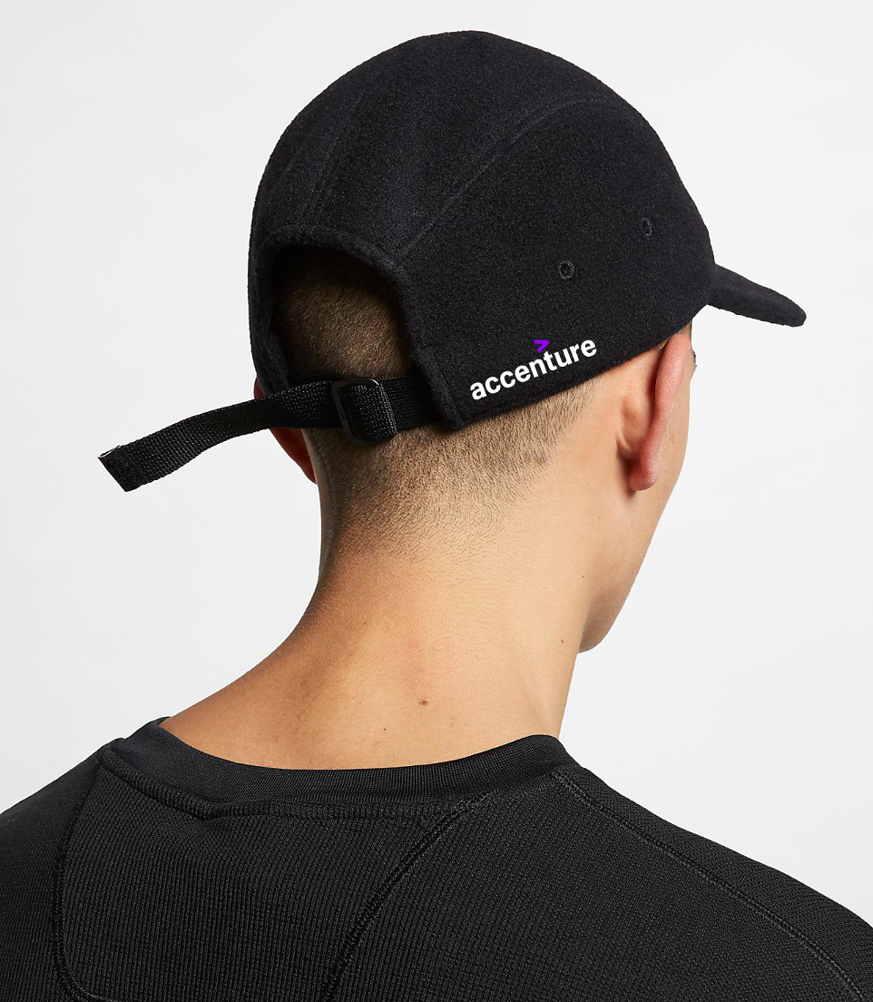
They thrive in motion and are responsive across changing conditions. Motion design was pivotal to our development of a system that embraces change; we delivered motion files of each brand asset in addition to their static counterparts. We explored a modern approach to their logo suite, creating a digital-first framework for scalability at all sizes, in all conditions.
Proprietary typography became
another pivotal element
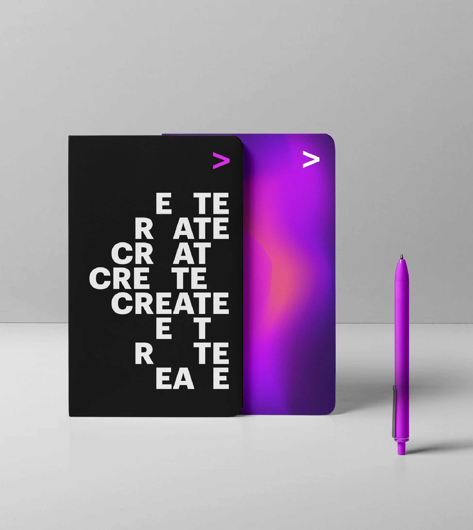
If typography was a human voice, it should have nuance and emotion. We created expressive effects – one technological and the other human – reflecting the duality of the brand idea. In doing so, we have built a thoroughly modern brand that incorporates these characteristics into its DNA.

As Accenture’s long-standing partner, we’ve maintained a strong connection with their brand team. That inherent trust has given us permission to radically evolve their brand system. Secondly, we’ve been able to create a new way forward for Accenture – that like all technology companies at this moment in time, is grappling with how to address what is missing – humanity. We introduced authentic portraiture and UGC in a newly-formed photographic system. We developed a nuanced color palette– reflecting the diversity of the human experience. We treated typography as if it were a human voice– able to change its emotional tone & tenor in a contextually-aware sensibility.
In addition to crafting an updated, beautifully modern VisID system, we forged a new approach to brand system design – allowing flexibility into the very fabric of the brand. We introduced a series of brand principles instead of brand guidelines. The idea was that in order to fully embrace change– the brand elements needed to be built on a spectrum so that future creative work could dial up or down certain elements to fit the content. The new brand is flexible, not fixed. This ethos can be seen in the new expressive typographic system that mimics the emotional range of a human voice; the new color palette that reflects a more vibrant and complex human experience; and photography that celebrates authentic portraiture: real humans in real spaces having real interactions. Creatives are humans, not robots. This inherently flexible system gives them a powerful toolkit to create compelling stories.


